


4 high-converting landing page hacks + resources
4 high-converting landing page hacks + resources
No. 3 will surprise you

This week, we improved our landing page for TweetHustler again.
Why a landing page you ask?
Several good reasons:
it’s more customizable than the gumroad page
it looks more professional with your own domain (in our case: tweethustler.com)
SEO leads have a 14.6% close rate (source: Hubspot and ahref)
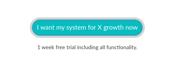
Here’s what it looks like now above the fold:

Let’s dive into the inspirations and resources so that you can apply this to your landing page too.
1. Above the fold
This is the first thing people see when they open your website.
Since attention spans are low, it should clarify in a split of a second what your product does.
So I focused on putting it in one sentence what TweetHustler does.
The inspiration came to me, when I was researching css grids to make the technical structure of the website:
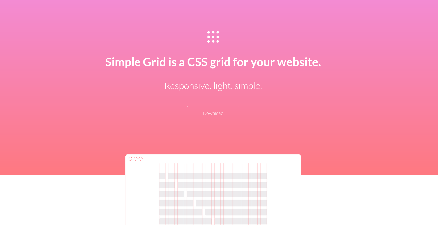
This is https://simplegrid.io/. They have done a beautiful job in simplifying and nailing what their product does I feel. The colours are amazing too.
I instantly loved everything about it, so I transferred it to TweetHustler:
one sentence what it does
3 powerful words for more details
a clear CTA button
integrating the next bit by shifting it up into the colourful header
Now that we talk about it, I feel I need one more iteration with the spaces. The three white boxes could be further into the colourful part to connect it more.
2. Numbers
You probably know this from tweets or thread hooks: when you include a number of some sort, your tweets will do better:
12 surprising productivity hacks that actually work
give me 2 min and I’ll show you how to be more productive than 99% of the population
15 need-to-know statistics to 3x your conversion rate
My best guess is that it’s because it is perceived as ultra-specific.
So if it’s a headline, a hook, a landing page or your ebook title: include a number to increase the engagement with it.
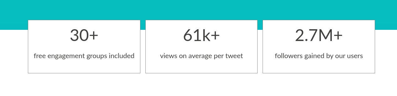
Bonus: I get asked often if there are engagement groups already included in TweetHustler. The answer is yes, and now we even have a number to go with it.
Win win.
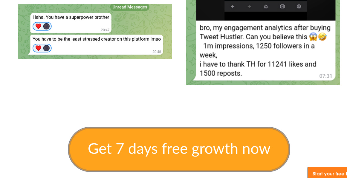
3. Testimonials overload
Social proof is strong.
It’s deeply rooted in human nature I feel.
When others are using it, it must be good.
Personally, I make buying decisions like this too. I ask friends for their recommendation and go with that. Or I read testimonials and judge by that.
Luckily, I’ve got a ton of testimonials. Often, new users simply reach out to me and tell me about their experience.
If you don’t have any yet, reach out to friends or give your product or service away for free to get some.
This is what the testimonial section looks like now:
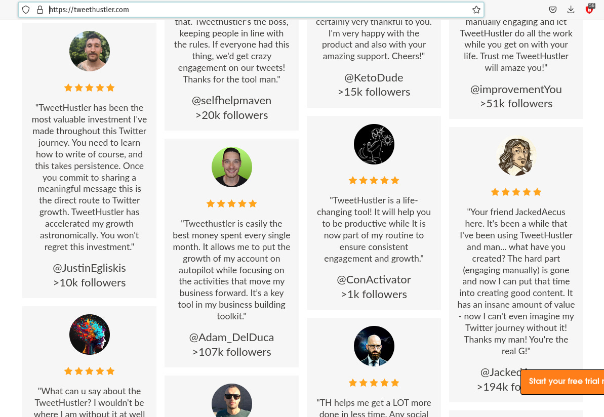
The inspiration for the format came from Hormozi’s acquisition.com shop: https://shop.acquisition.com/
He’s done an amazing job with everything, so lots of bits and pieces to get inspired from.
I also included a testimonial screenshot section below because I like the natural look of it:

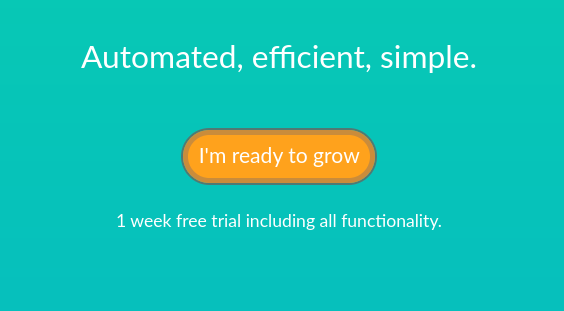
4. CTA Buttons
Of course, a landing page means nothing if there aren’t strong call-to-action buttons on it (CTA).
CTAs have the job to convert the traffic into leads and the leads into paying customers.
So I thought I spice things up a bit.
I added 4 of them in strategic places, varied the text and applied what I learned here:
https://klientboost.com/marketing/call-to-action-examples/
They also change colour, have a sort of pulsing effect and it’s hard to overlook them.
Needless to say, I enjoyed it a ton to code that.
Here they are:

Action plan
Check the structure of your landing page:
can you clarify the above the fold part to show what your product/service does?
can you include numbers in your headlines/content/lists?
can you spice up your CTAs and put them in strategic places?
can you make your CTAs unoverlookable somehow (I read orange and red convert best for CTAs. And if the button moves, the brain has to look at it, since it could be a saber tooth tiger in the bushes)?
can you include more testimonials? Written ones, video ones, screenshots?
Final quick tip:
I also included video testimonials at the beginning of the landing page. They need loading="lazy" so that the page renders even before the videos are fully loaded.
Else they’re render blocking, which can lead to a higher bounce rate. I made this mistake and just corrected it, so I thought it’s worth mentioning.
Check out our new landing page here and let me know what you think in the comments. If you have more ideas for improvements or landing page resources you love, I’m all ears ;-)
Hope this helps!
Have a beautiful weekend,
prodHackers