


How one little thing can skyrocket your lead generation
How one little thing can skyrocket your lead generation
Simple steps including action plan

If you follow this newsletter for a while, you already know how to generate traffic on twitter with ease.
Here’s a collection of past issues on how to do so if you’re new or like a reminder:


The next step?
Turning the traffic into leads.
Personally, I’m working on this part right now to improve it.
Figuring out the best ways and then sharing them with you.
Put a landing page link into your bio
So one thing I did this week was to release a new landing page (yes, I’m in landing page creation mode right now).

And if you think that looks a lot like the TweetHustler landing page, you’re right of course.
I’m aiming at a consistent branding (and copy pasting the design I made for the TH landing page was more effortless too ;-))
I’ve put the link in my bio at the beginning of the week and am seeing two brilliant things:
we made more TweetHustler sales than in the past weeks
I’m negotiating 3 brand deals right now
No. 2 is particularly surprising for me, and I love it. Because it means we can help other small businesses to get more reach and help our audience to discover cool new solutions. Win-win.
Of course, it’s one thing to have people click on your bio link and then another to convert them to make a sale.
This is where nuanced marketing and positioning comes in.
And it takes a good amount of iteration to make this sales funnel work, at least that’s what I have experienced.
So let me share the processes and thoughts that went into the landing page in the hopes that they help you as well:
remove friction wherever possible
reduce the number of options to avoid sending leads into analysis paralysis
use powerful copywriting to pin point the value with utmost clarity
Let’s go into this in more detail using the new prodHackers.com link and landing page.
Friction removal
Having the prodhackers.com domain fits our twitter account name.
Having this link in our bio looks clean, organized and there’s no thinking involved to whom this may belong.
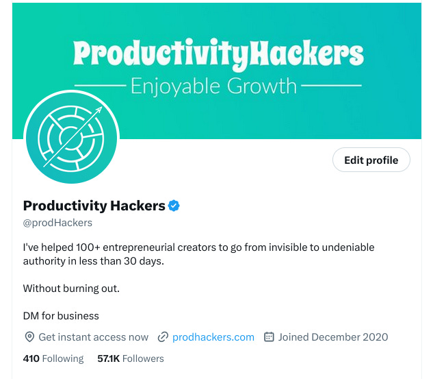
And when you click on it, you’re greeted with the same colours and our logo.
So I feel this is a smooth thing.
The landing page itself contains our value proposition above the fold.
So it’s the first thing people see, and they don’t have to click somewhere else or spend any energy on what this might all be about.
Reduce the number of options
Do you know these fun experiments they did with offering people an array of tasty fruit jams? (here are more details: https://hbr.org/2006/06/more-isnt-always-better)
If you have too many options, you go into analysis paralysis and on top of that are more unhappy with the decision - if you managed to make one at all.
So it’s a paradox: by offering less options, people have an easier time making a decision and are happier with it.
Therefore, I boiled things down on our landing page to 3 simple options:
join the free newsletter
check out TweetHustler
borrow our audience (that’s the brand deal option and of course also paid RTs. I wonder though, if people realize the paid RTs part)

I highlighted the middle option - which is TweetHustler - by using a special button that changes colour and has a pulse effect.
And if you think you know this from somewhere, you’re right of course. I used this on the TweetHustler landing page as well, such a fun effect.
Powerful copywriting
Every little piece of the landing page is carefully crafted:
power words everywhere (discover, secrets, effortless growth, instant access, tactics and tools, big players, influencers, become a traffic master, undeniable authority)
and of course numbers. For some reason, people love numbers. It makes things more specific and threads with numbers in the hooks do better as well.
triggering curiosity and inviting to a transformation.
The scientist in me wanted to make three descriptive buttons that say: Newsletter, TweetHustler, Brand deal & paid RTs.
But that’s boring and doesn’t invoke curiosity. So I packaged those offers into words that trigger curiosity: “see what’s in for you here“.
And I focused on using words that induce a transformation: discover, become, go from.
Action Plan
Ask yourself:
how can you remove more friction and simplify?
how can you spice things up by adding more power words and numbers?
how can you reduce the number of options for your offer?
how can you invoke the feeling of your offer provides a transformation?
how can you add curiosity?
As usual, to get to the bottom of these questions, I recommend grabbing a nice cup of tea to journal by the fire place.
If you don’t have a fire place, there are lovely youTube videos that make you feel like you have one, like this:
This thing has 125mio views.
Evergreen content at its best. And enjoyable too.
Hope this helps!
Have a lovely weekend,
prodHackers