Another round of landing page optimization has been done this week.
After analyzing where people bounce off, I realized I had the order of the elements all wrong.
Here’s the structure I had before:
headline + subheadline
how it works
who’s it for
the pain points the tool solves
benefits
testimonials
FAQs
pricing
Do you spot my mistakes?
Let’s assume someone has no idea what the tool is all about. And immediately after reading a benefit in the headline, I throw them into how it works.
This was a reflection of the way I think. Because I’m a tech nerd. Before I want to know anything, I need to know the tech stack and if it fits into my current one.
It’s like a filter through which I view the world.
Let’s assume though, that the visitor isn’t from tech, but rather from marketing or a coach or founder. They probably don’t care as much as I do about the tech stack, but more about what the tool can do for them.
Does it increase lead influx? Can I put it on auto pilot? Are probably more likely questions they will ask themselves.
So I switched it and basically redid every section. Now we’ve got:
headline
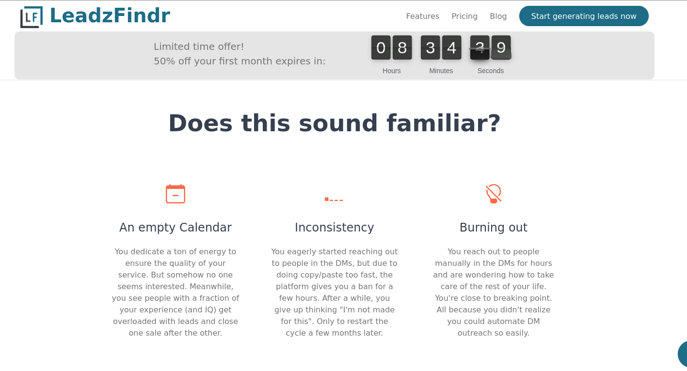
creating empathy by communicating the problems they face in their day to day (“Does this sound familiar?“). This was easy to write, because I felt those pains too - hence I coded the tool
benefits: specific outcomes and workflows they can expect
who’s this tool for
testimonials
turned the “how it works” section into “Here’s what you can do with the tool“
FAQs
pricing
Countdown
On top of those changes, I also added a countdown timer for 50% off in your first month to give an incentive to try it out.
Before, I had the timer at the bottom where the pricing is. But - if people bounce off earlier, they never see it!
So, this time, I’ve put the timer into the top menu. It’s always visible and it’s also a dynamic element.
Which means it will grab your attention, because our brains are wired to notice things that move in the distance. Could be a saber tooth tiger that wants to eat you - but luckily in this instance, it’s just a countdown timer providing an incentive to get started with generating leads.
Measuring
What I’m sharing today is based on what I saw in my website analytics.
I’m using matomo, an open source solution that is located on our own servers. It allows to capture what people see on the page and also with which elements they interact with. All anonymised according to data privacy of course.
When I went through the data I realized, they bounce off too early. So this is my iteration to try and fix it. It’s live since yesterday, so I will know in a week or two if it improved the situation once I’ve got enough data.
And this is something you can do too, whatever you’re selling.
Measure the conversion rates.
Measure if and where people bounce off.
Measure and analyze what you see and then iterate.
Rinse and repeat.
It’s what works in science and it’s what works in marketing.
Hope this helps.
Cheers,
Mira
PS: oh, and if you’re curious to see the new landing page version, it’s here.


Thanks for sharing your experience with this Mira! How do you measure where people bounce off the landing page?
It’s interesting how even landing pages mirror the way we think.
We arrange headlines, benefits, and countdowns, trying to predict how attention moves, what will make someone stay.
But maybe the deeper craft isn’t in optimizing clicks, it’s in remembering that behind every bounce is a human pulse deciding if something feels true.
Conversion is just a technical word for trust.
And trust, like attention, can’t really be engineered, only earned.